 "Pessimippopotamus" (pessimippopotamus)
02/26/2014 at 16:11 • Filed to: Kinja
 10
10
 18
18|
"Pessimippopotamus" (pessimippopotamus)
02/26/2014 at 16:11 • Filed to: Kinja | 10
| 18 |
I'm almost sure someone already brought this up. The new Kinja sorts comments much like the older ones, except it only shows a select number of comment threads and the others are consigned to the crapshoot list with unreadable organization. Now, the problem with the new version is that it does not truncate all the replies that featured threads get. Take a look at the post about the !!!error: Indecipherable SUB-paragraph formatting!!! . The second thread has ballooned up into nothing but thinly veiled insults commenters are lobbing at each other. If it were like the older one, we'd just read the three first comments, then move on, or we'd have the option of joining in after seeing an indicator that tells you that there are gazillions of followup comments on it. But in the new one? Nope. We have to scroll past worthless comments that we don't want to read. What a waste of space. It's like Disqus. I prefer the Kinja we had, buggy or not.
!!! UNKNOWN CONTENT TYPE !!!
*There also seems to be two separate threads in response to the original poster in that second thread? How does that work?!??
 ttyymmnn
> Pessimippopotamus
ttyymmnn
> Pessimippopotamus
02/26/2014 at 16:14 |
|
You touch on one of my major concerns about the new system. You can't see how many replies or recommendations a post has received, so you have no idea if it's worth opening the conversation. This may well change, but once again, Gawker has rolled out features that aren't ready for primetime.
 Racescort666
> Pessimippopotamus
Racescort666
> Pessimippopotamus
02/26/2014 at 16:17 |
|
I'm not really a fan of complaining just to complain (as tends to happen when these changes are implemented) but this is actually a very good example of how the new format hurts participation and meaningful content.
If there is a better answer than "it's under development" that can explain how changes to the new format can clean this up, please share. If not, just say so.
 ADabOfOppo; Gone Plaid (Instructables Can Be Confusable)
> Pessimippopotamus
ADabOfOppo; Gone Plaid (Instructables Can Be Confusable)
> Pessimippopotamus
02/26/2014 at 16:18 |
|
I was about to post precisely this same point.
 CobraJoe
> Pessimippopotamus
CobraJoe
> Pessimippopotamus
02/26/2014 at 16:18 |
|
Tied into that complaint: If you don't want to read the comment thread with the insults, or the comment thread with all the fapping gifs... You only have one choice: to view all comments by time, which is mostly just a random selection of fapping gifs and insults thrown in with the comments you might want to reply too. So, read only the top couple discussions, or try to wade through all the individual comments not sorted by discussion.
That's the only options.
 Thunder-Lips
> Pessimippopotamus
Thunder-Lips
> Pessimippopotamus
02/26/2014 at 16:18 |
|
I definitly don't like being made to read some of the crap out there....so much inane shit. I almost forgot how many comments are made that are redundant, because somebody didn't read the thread....yeah, crappy.
|
Pessimippopotamus
> Thunder-Lips
02/26/2014 at 16:19 |
|
In this case, it's partially justified because no one can read the threads.
 Zoom
> Pessimippopotamus
Zoom
> Pessimippopotamus
02/26/2014 at 16:20 |
|
Garbage. Pure frickin garbage.
You can't see if a post is worth following becasue of no count. ie QOTD has no counter so you can't tell if there are 600 posts ahead of you.
I'm getting more and more apathetic to this site.
Not oppo. It's cool here for now.....
|
Thunder-Lips
> Pessimippopotamus
02/26/2014 at 16:21 |
|
Oh, I get that, but those are the kind of comments that get left in the gray zone usually, and now they are up in our faces......
 BrtStlnd
> Pessimippopotamus
BrtStlnd
> Pessimippopotamus
02/26/2014 at 16:27 |
|
Yeah that's a great example of a HUGE shortcoming. Clicking the 'all replies by time' is even worse... EVERY comment gets shown as a random smattering of shit thrown at the wall in chronological order. I'm sure it'll change 584,739 times in the next couple weeks anyway, but still this is the typical comment clusterfuck when they mess with their system.
 Korea Miéville
> Pessimippopotamus
Korea Miéville
> Pessimippopotamus
02/26/2014 at 16:39 |
|
I can — kinda — see the reasoning behind the change to the comment system, but the implementation is not good. Something as simple and straightforward as reading comment threads now requires more clicks, which is a pain in the ass, and it's less clear what comments are in what threads. It's also harder now to move from Jalopnik to Opposite Lock if, like me, you scroll down to the bottom of the page at Jalopnik then want to switch over. Now you've got to scroll back to the top. Why? There isn't really any benefit I can see to this change, yet it makes moving around a little harder than it used to be.
I hate to be that guy who complains about every redesign, but these changes are objectively worse from a user point of view. This looks like a classic example of designers building an interface based on what's conceptually logical on paper rather than thinking about what's actually easier or more friendly to users.
 Wurrwulf
> Pessimippopotamus
Wurrwulf
> Pessimippopotamus
02/26/2014 at 16:52 |
|
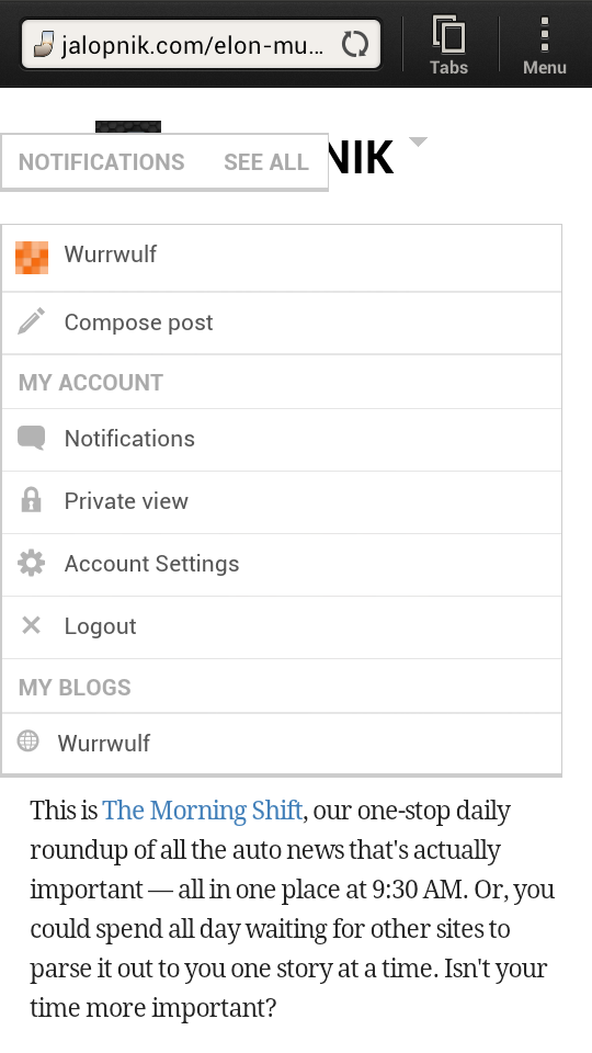
I can't read the Jalopnik home page on my phone, which is the only time I'm on Gawker sites. One third of my screen is covered with the drop down menu for the account management. If I click in the top left of that box, the box expands to cover three quarter of the screen. I know that I'm stupid, but does any one else have this issue? I'll try to attach a screenshot of what the home page looks like when it first loads.
 duurtlang
> BrtStlnd
duurtlang
> BrtStlnd
02/26/2014 at 17:43 |
|
It's like all the previous major changes in the past. A temporary but huge setback, resulting in a practically unusable comment section for at least a week or two. Gawker will fix most if not all of the problems and it will become fine again. Eventually. I know I will cut back on using this 'Tiger' upgrade for a few weeks.
|
Pessimippopotamus
> Wurrwulf
02/26/2014 at 18:16 |
|
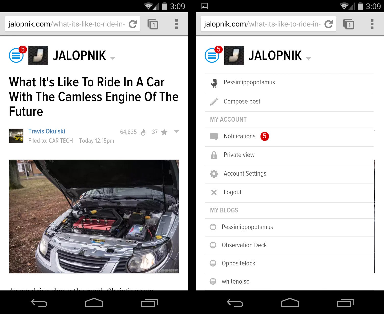
Wait. What browser are you using?
The main page looks fine to me on mobile, and I can open and close the dropdown menu by pressing the circle icon on the upper left corner. I guess they have to fix support for certain phones.
|
Wurrwulf
> Pessimippopotamus
02/26/2014 at 18:28 |
|
I'm using a HTC One S through T-Mobile. I'm running the standard internet app from the T-Mobile Android interface I don't know if it's a phone issue or a Tiger issue. I can't toggle that drop down box to be out of the way. It's either in the way or the entire screen, regardless of pinch-to-zoom. None of the other Gawker sites do it, and neither do the individual blogs on Jalopnik (Truck Yeah, R&T, etc.). Maybe it's just my phone being a dickhead.
|
Wurrwulf
> Wurrwulf
02/26/2014 at 18:32 |
|
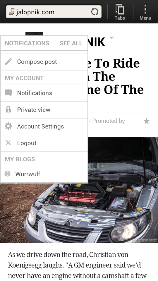
For the sake of comparison. Damnit, now I can't attach two pictures to one post.
|
Pessimippopotamus
> Wurrwulf
02/26/2014 at 18:32 |
|
Ah. You probably have the AOSP (stock) browser then. Sadly the development on stock browser's all but halted, or the new versions can't be delivered to you because the HTC One S is no longer receiving system updates.
Other browsers like Chrome, Dolphin, or Opera would probably load the page fine. Chrome is a resource hog, so maybe it's not a good fit for older phones, but Dolphin and Opera have lightweight versions. Might be worth trying them out.
|
Wurrwulf
> Wurrwulf
02/26/2014 at 18:33 |
|

The things we do for free entertainment...
 Dale Franks
> Pessimippopotamus
Dale Franks
> Pessimippopotamus
04/04/2014 at 00:33 |
|
Dealing with the new comments system is worse than being stabbed.